Creator Website and Portal
OOOH.TV
social media and creator platform
I designed and developed Oooh’s creator website before the team went to VidCon 2022, and designed the in-app verified creator portal where partners tracked monthly earnings and configured PayPal payouts.
収益
遊びを作る人には、稼いだ額と入金までの道のりが、ちゃんと見えていてほしい。
The creator website, before VidCon
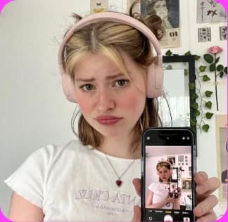
I designed and developed the creator website before the team went to VidCon 2022. It gave partner managers and booth visitors a clear pitch: host an Oooh, collect fan video submissions, and feature them live on stream.
I structured the landing page around what creators could do with their audience first, followed by community proof and game formats, and adapted the masthead across desktop and mobile breakpoints.

 For creators
Feature fans
in your streams
AI moderation for your fans’ video submissions.
Receive videos from your community, react instantly, and feature your favorites. Even live on stream.
Join over 10,000 creators using Oooh
For All-creators. Big and Small. And All-ages.







Use Left and Right arrow keys to browse; Home and End reach the first and last items. You can also swipe or drag.
My creator website masthead and opening.
Creators and fans, side by side
I dedicated a full section of the creator site to co-op formats. The gameplay previews showed how creators and fans appeared side by side inside Pancake Stack, Splash Pong, and Clout Chasers.

Collaborate with
your community
Oooh is the only platform that allows you to
create group collab videos.
#Community-source your content! Take all of your submissions and feature the best. Feature hundreds of fans in one video if you want. Oooh is the fastest way to run a contest, host a Q&A, create a new song or dance with fan submissions, or collab to create a whole new genre of Creator+Fan videos.
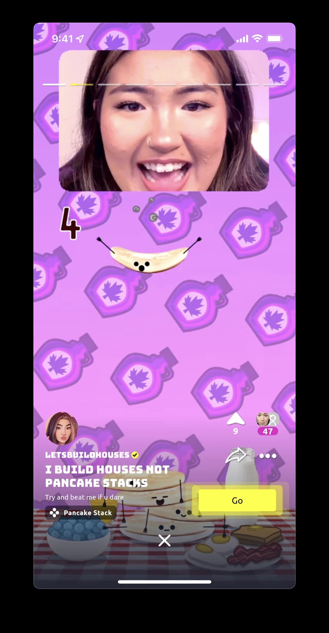
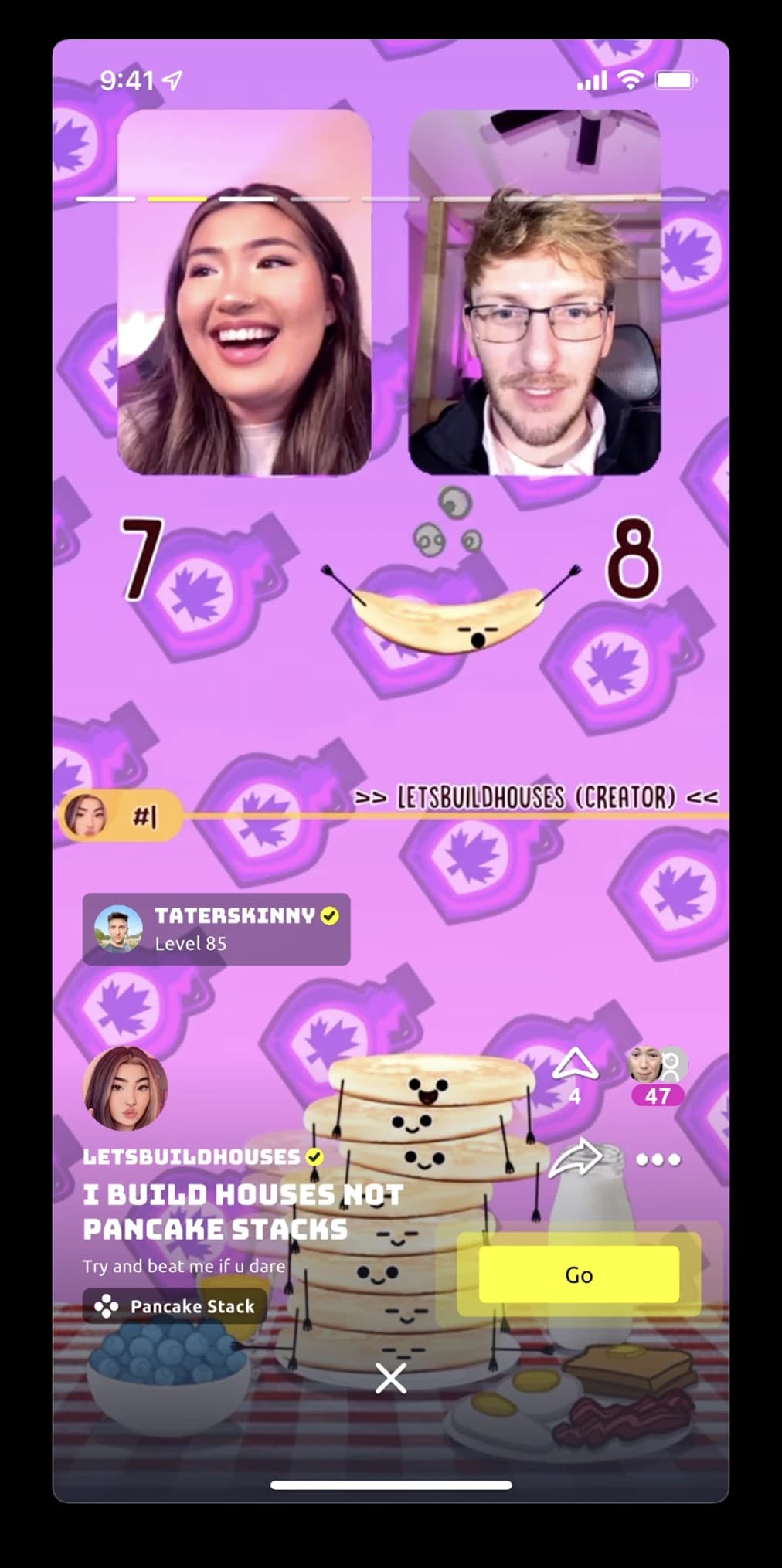
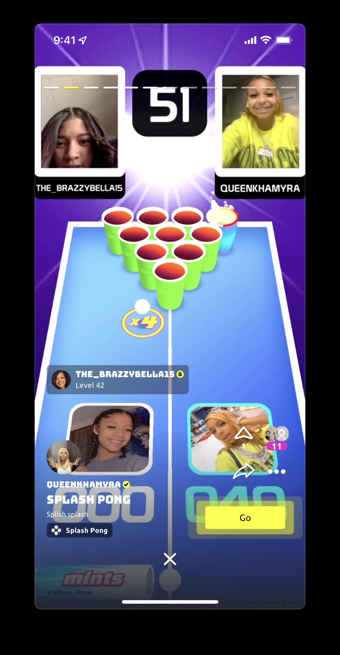
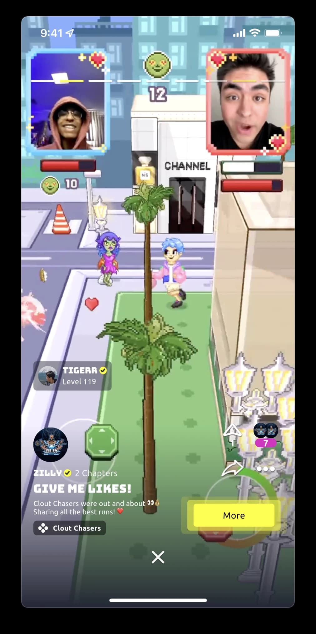
The creator website’s collaboration section and gameplay examples. The exclusivity language is historical marketing copy, not a verified comparison with other platforms.
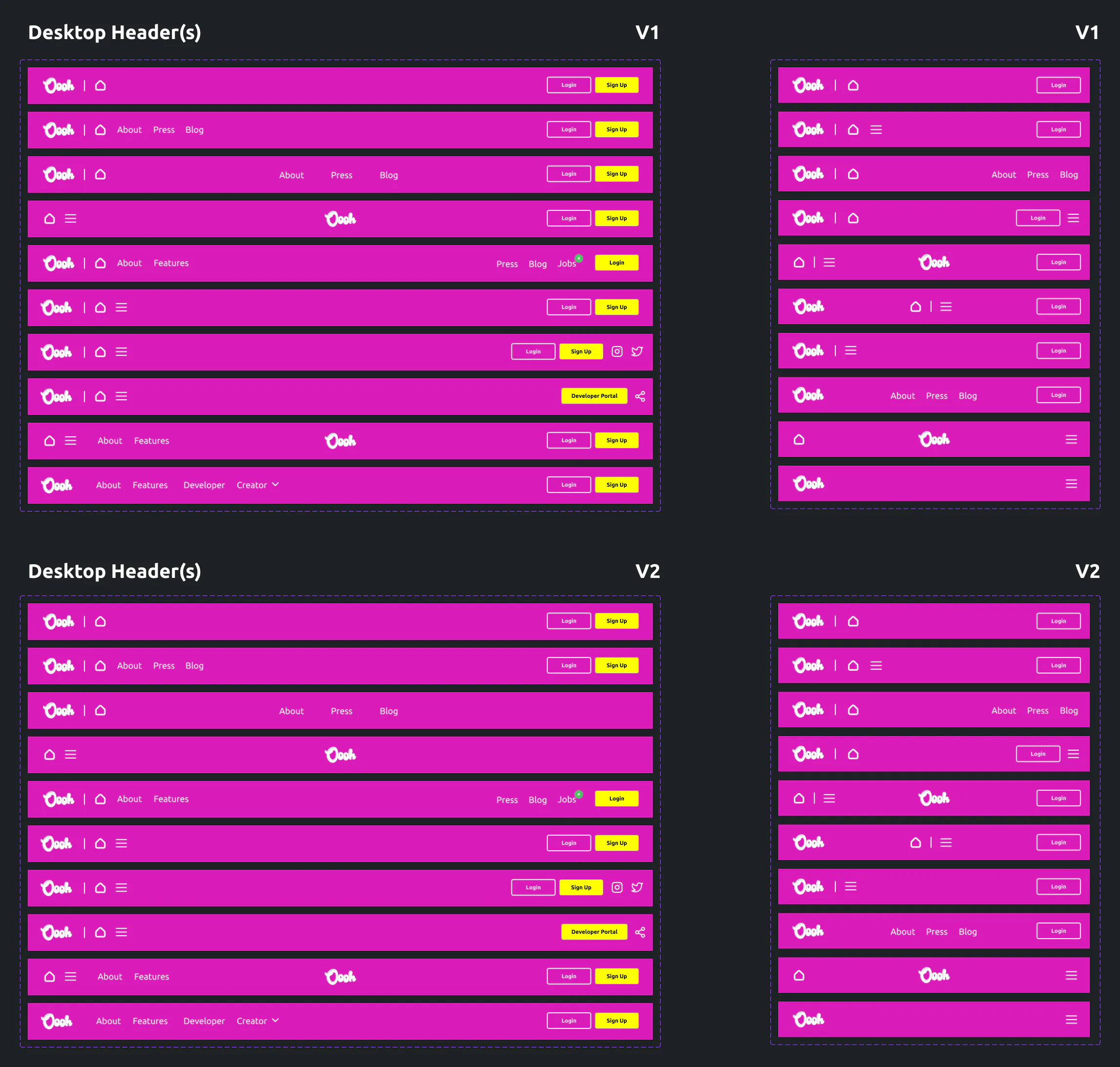
Desktop headers
Two rounds of responsive header explorations for the creator site, testing how navigation links, social icons, auth actions, and the Developer Portal CTA collapsed from desktop into tablet widths.
Use Left and Right arrow keys to browse; Home and End reach the first and last items. You can also swipe or drag.
Desktop header explorations, V1 and V2.
Earnings and payment
Inside the app, verified creators needed to see how their monthly coins translated into dollars and where those coins came from. I broke earnings down by boosted views, boosted reacts, and premium Ooohs, and kept PayPal onboarding to a single screen.
Because payout forms are high-trust surfaces, I designed every failure and recovery state explicitly: a retry banner when monthly totals fail to load, field-by-field validation on PayPal details, and a discard confirmation before backing out of unsaved edits.
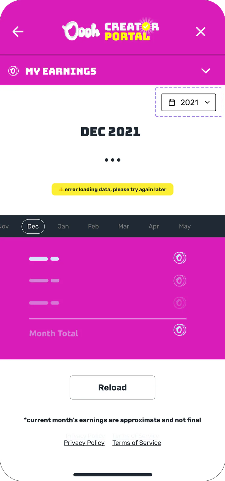
Won’t load
When monthly data fails to fetch, placeholder bars hold the layout and offer an inline Reload action.
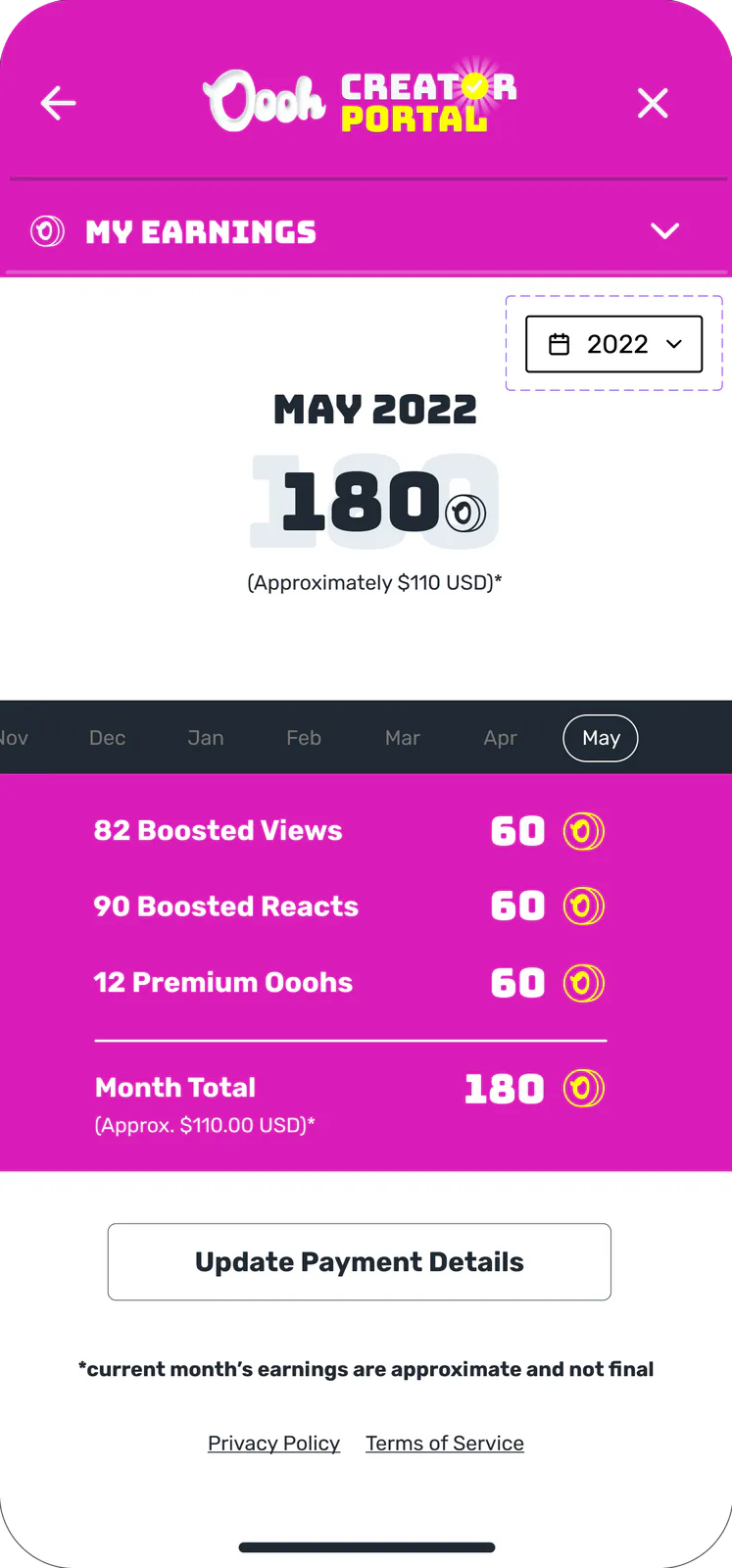
One month
Monthly coins broken down by source alongside an approximate US dollar total.
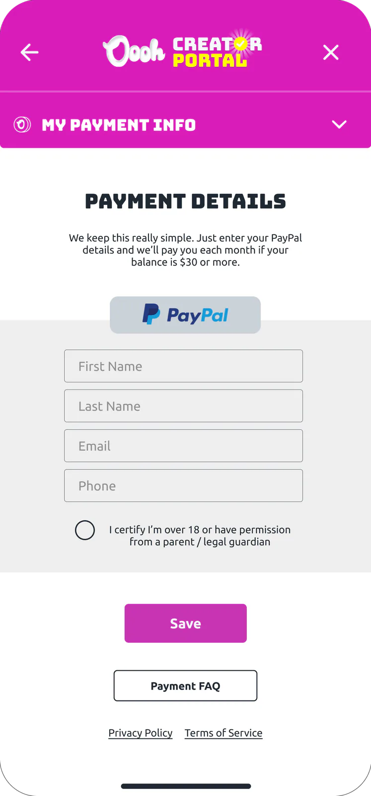
Payment details
PayPal name, email, and phone fields paired with an age or guardian-consent check.
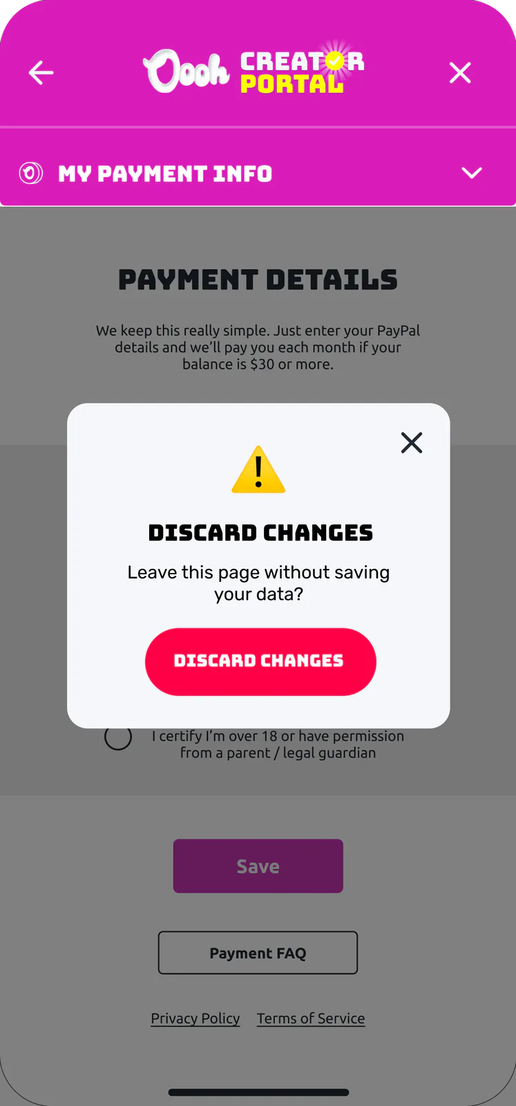
Leaving
An explicit confirmation modal prevents accidental back-taps from wiping unsaved payout info.
- One bad field: The field gets a red cross, Save stays off, and the form says “*Invalid Characters”.
- Several bad fields: Each bad field gets a cross and each good one a check, with one line for all of them: “* Please fix the multiple errors”.
- Bad email ending: The email field is marked, Save stays off, and the form says “* Invalid URL extension for Email”.
- Leaving unsaved: A dialog asks “Leave this page without saving your data?”
- Save fails: The details stay, Save stays on, and a yellow line says “Error saving data ... please try again”.
Verified Creator Portal screens. Months, coins and dollar amounts are design samples, and the payout line in the form is the screen’s copy, not a stated policy. The rules quote the booklet’s payment states board.
Payment FAQ
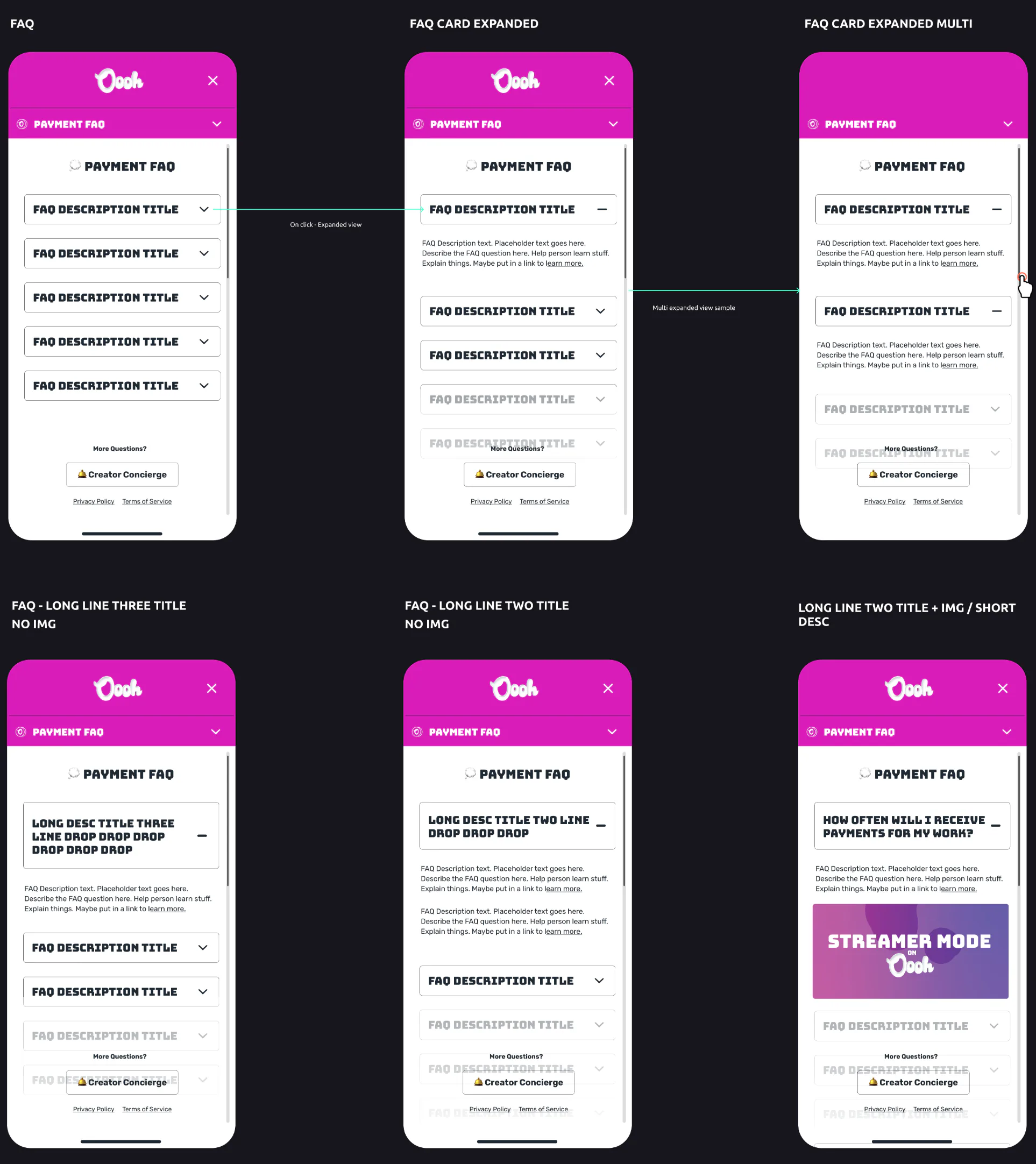
To cut down support tickets around payouts, I designed an in-app FAQ accordion that handled multi-line questions, long-form answers, and embedded feature banners while letting creators keep multiple cards open at once.
Use Left and Right arrow keys to browse; Home and End reach the first and last items. You can also swipe or drag.
Six of the FAQ Portal board’s eight states. Card text is the board’s placeholder copy.
ABOUT

I’m Matt Stenquist, a Product Design Engineer and former professional snowboarder. I started coding at nine, shipped modded hardware and games by 16, and turned pro by 22. A few broken bones and a gold tooth later, I design and code consumer apps, Figma component systems, and AI developer tools from scratch.
LEARN MORE